Monday, December 30, 2019

#50 - Is This It: The Strokes (2001)


This is kind of a two for one. This one shows subatomic particle tracks in a bubble chamber. It’s trippy, it’s cool, it’s kind of fascinating. Originally, though, the cover was quite different: 


That’s the UK version, by the way. Not too surprisingly, it caused quite a fuss.

The photographer was Colin Lane. The model was his then girlfriend, whose identity he would never reveal. 


Lane has 20 credits, including more for the Strokes, a couple for the Kings of Leon, and others for bands I’m not cool enough to have heard of before. 


He never seems to be the art director, though, so I’m not sure if these are his covers, or someone directed his shots, or if he just took some pix for the band for the insert or the back cover.

He did do the pix of this band for Is This It, which are great. I mean, honestly, could these guys be any cooler (well, except for the guy on the left, that is)?


I guess that’s a pretty good description of the band in general. Their sound is just so hip, cool, New York to me. Indeed, front man Julian Casablancas cites Lou Reed as a big influence.


Nikolai Fraiture (bass), Julian Casablancas (vocals), Fab Moretti (drums), Nick Valensi (guitar), Albert Hammond Jr. (guitar)

This was their first album, and arguably their best. Indeed, the band that was supposed to “save rock” has not aged that well. Is This It, though, remains one of the tightest albums ever.

Oh, the subatomic stuff? Casablancas happened upon it, saying “I found something even cooler than the ass picture." I honestly don’t know much more about it. It’s typically totally overshadowed by the “ass picture.”

The only other covers I have any feelings for:


Of course there are parodies:


<#51                    #49>

Saturday, December 21, 2019

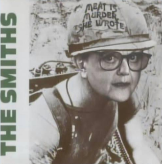
#51 - Meat Is Murder: The Smiths (1985)


The Smiths had a definite look when it came to album covers. They were famous for black & white photos of minor cultural icons rendered in various tints (duotones). 


They were all designed by singer Morrisey and the Rough Trade (record company) art director Jo Slee.  (She has 60 credits on discogs.com - all of them for The Smiths or Morrissey.)


This one’s a little different though. First, it’s straight black & white (no tints). It then repeats the image a la Warhol.

There’s also the famous photoshop (or whatever they used back then) of the original slogan. That original, by the way, just so happened to say, “Make war not love.”


The title means exactly what you think it means, reflecting front man Morrisey’s strong vegan beliefs. The Smiths’ second album, it’s their sole one to go to #1, though it really doesn’t have any classic hits, except for maybe “How Soon Is Now?”

I loved the Smiths. Still do. Those jangly guitars, Morrisey’s supple voice, the back-to-basic (but very post-punk) arrangements, the super catchy (but never saccharine) tunes, the great (though morose) lyrics …


Bassist Andy Rourke, Morrisey, drummer Mike Joyce, guitar god Johnny Marr

As with any famous image, it’s lent itself to more than its fair share of parodies.


<#52                    #50>

Saturday, December 14, 2019

#52 - A Hard Day's Night: The Beatles (1964)


The Beatles? Again? And with Robert Freeman to boot? It’s like a broken … um … what is it now? Oh yeah, record!

In this one, Freeman wanted to play off the film (of the same name) by taking multiple shots of each of the lads and making them look a little like the frames of a movie.

This look was for the Brit release only. It looked rather different in the US.


And that blue and red theme means it’s probably a good time to share the Beatles’ two greatest hits albums. 


I just love that juxtaposition. The original was done by Angus McBean. Not sure if he did that second one. These two are known as the red & blue albums (to go with the white album, I guess).


Interestingly, Freeman gets credit for only one solo Beatle album


A Hard Day’s Night was actually a movie before it was an album. Shot in black and white, the movie was a day-in-the-life look at the band. 


It also involved quite a bit of gamboling about

It was directed by Richard Lester, who also directed Help, Lennon’s How I Won the War, a couple of Superman flicks, and a bunch of pretty forgettable stuff. 


A Hard Day’s Night, though, is actually pretty good (and still fresh today), and was also surprisingly influential.

The album was half hits from the movie and half new stuff. Hits include the title song and “Can’t Buy Me Love.”

Not too surprising, but there are plenty of parodies/homages for this one.


That last one’s my particular fave.


<#53                    #51>

Friday, December 6, 2019

#53 - With the Beatles: The Beatles (1963)


So, here we are … back With the Beatles (get it?). And back with Robert Freeman as well.


Considering this came out in 1963, this is pretty darn cool. The black & white, the lighting, Ringo down in the corner.

This was actually Freeman’s first album with the band. Brian Epstein had been impressed with Freeman’s jazz photography, and invited him on board. 

Trane … on flute?!?!

The boys asked him to take some ideas from Astrid Kircherr (fiancé of early Beatle Stu Sutcliffe and a pretty decent photographer) from their Hamburg days.


So glad they didn’t go with 4 

Man, the Beatles sure did have some lame-o titles in the early days – Introducing the Beatles, Meet the Beatles, The Beatles Second Album, Beatles 65, Beatles for Sale, Beatles VI …  Not that there weren’t plenty of hits on all of them. With the Beatles included “All My Loving,” “Roll Over Beethoven” (yup, there were plenty of covers back then), “Money,” and “I Wanna Be Your Man.” It was just their second album.

I guess you could call these homages:


These, though, are pure parody:


And, yes, that 3rd one is advertising a burlesque show.


<#54                    #52>