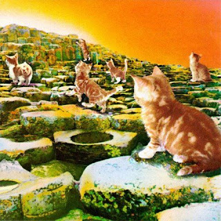
Well, at least they didn’t name this one “Led Zeppelin V.” Interestingly, the name came from a song that didn’t make it onto the album (but would appear on Physical Graffiti).
The art – at least the idea for it – came from Arthur C. Clarke’s Childhood’s End. It’s supposed to represent the end of the book, where children are drawn to a special spot where they will ascend to another world.
The image itself came courtesy of the graphic design firm Hipgnosis, who are behind a ton of other very well-known albums. This particular one was by Aubrey Powell, one of the co-founders (along with fellow genius Storm Thorgerson, whom we’ve seen here a number of times).
Actually, Storm was the original artist. He had come up with an image of a tennis court with a racket on it. The band thought he was implying that their music was a racket. So, they fired him.
The location was the Giant’s Causeway, in Northern Ireland. A fascinating structure, it’s made up of giant crystals of basalt, formed millions of years ago when a lava flow cooled at just the right temperature.
The figures are Stefan and Samantha Gates, child models whose images were reproduced and pasted in to form 11 figures total.
And here they are with their clothes on
Stefan is now a fairly-well known TV presenter in the UK.
He specializes in food and science shows
The interior shot is also pretty cool. It features Dunluce Castle, not too far away from the Causeway.
Overall, the art garnered a Grammy nomination. And the cover was ranked #6 overall by VH1.
I had this album as a kid, and absolutely loved it. It had a little lighter, brighter sound than their previous efforts, and was also pretty eclectic as well (vide the reggae “D’yer Maker.”). The hits on it are “The Song Remains the Same,” “The Rain Song,” and “No Quarter” (though my favorite was “Over the Hills and Far Away”).
Some more of Aubrey’s stuff:
And here's the band "at play”:
Kinda surprised I found only one parody out there:
<#27


No comments:
Post a Comment